Leumi Bank • Design system • 2025
Transfer Money
Redesigning the money transfer flow, with a new design system, for Leumi’s private banking website.
- Client
- Leumi Bank
- Sector
- Banking, Finance
- Duration
- 5 months, 2025
- Team
- Tal Gruber, Lead designer
Netta Zoe
The challenge
An outdated site, a flow people dropped out of, and no full redesign on the table.
Leumi’s private banking website was outdated, and customers were dropping off mid-flow, missing steps, or completing transfers incorrectly. The previous design agency had built a solution inside a popup that never launched, because the experience was too cramped and confusing. At the same time, the client wasn’t ready to redesign the full website. We needed to improve the experience within that constraint.
Through research, we found a way forward: internal flows could run in a URL-based full-screen takeover, giving us a dedicated environment to design properly without touching the existing site structure.
Context
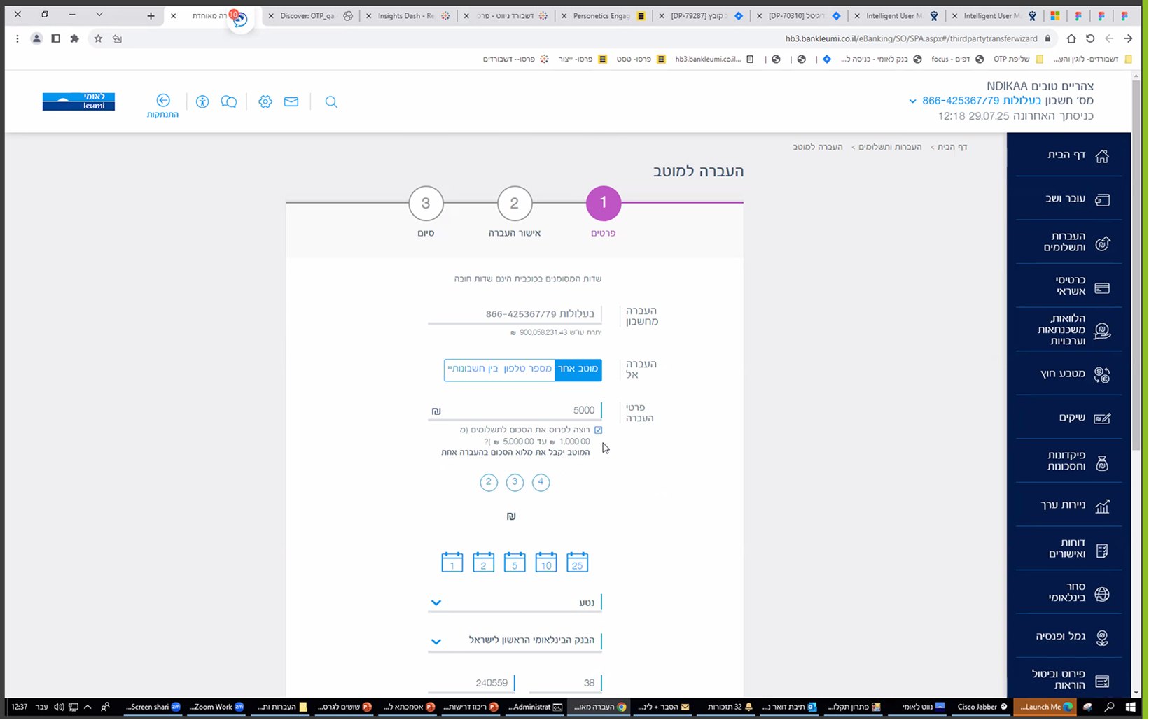
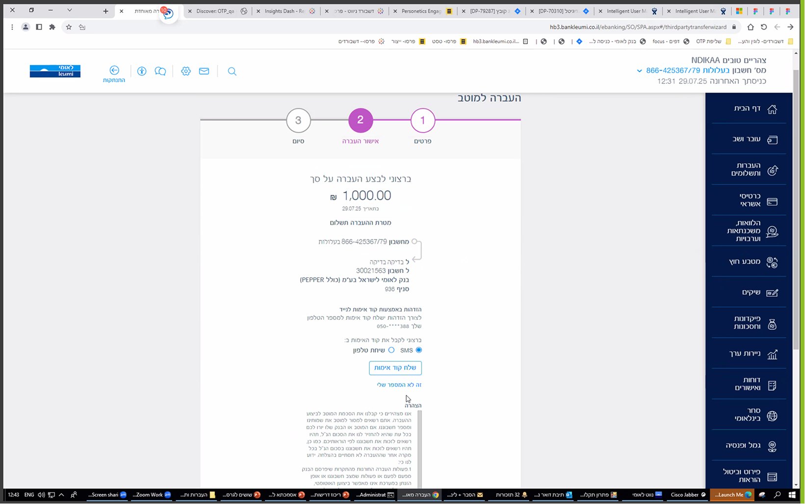
The previous experience.
Every decision sat on one long form inside the existing site: account, recipient, amount, installments and dates, all at once.
Problem statement
How might we redesign a complex banking flow within a site we couldn’t touch, and build the foundation for every flow that follows?
The design system
Foundation first.
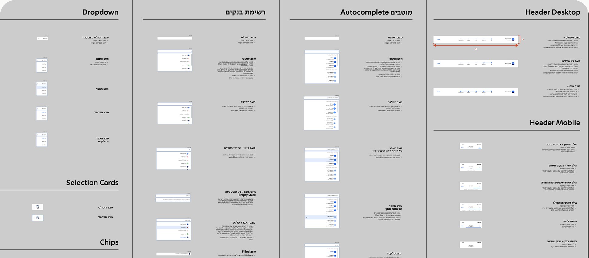
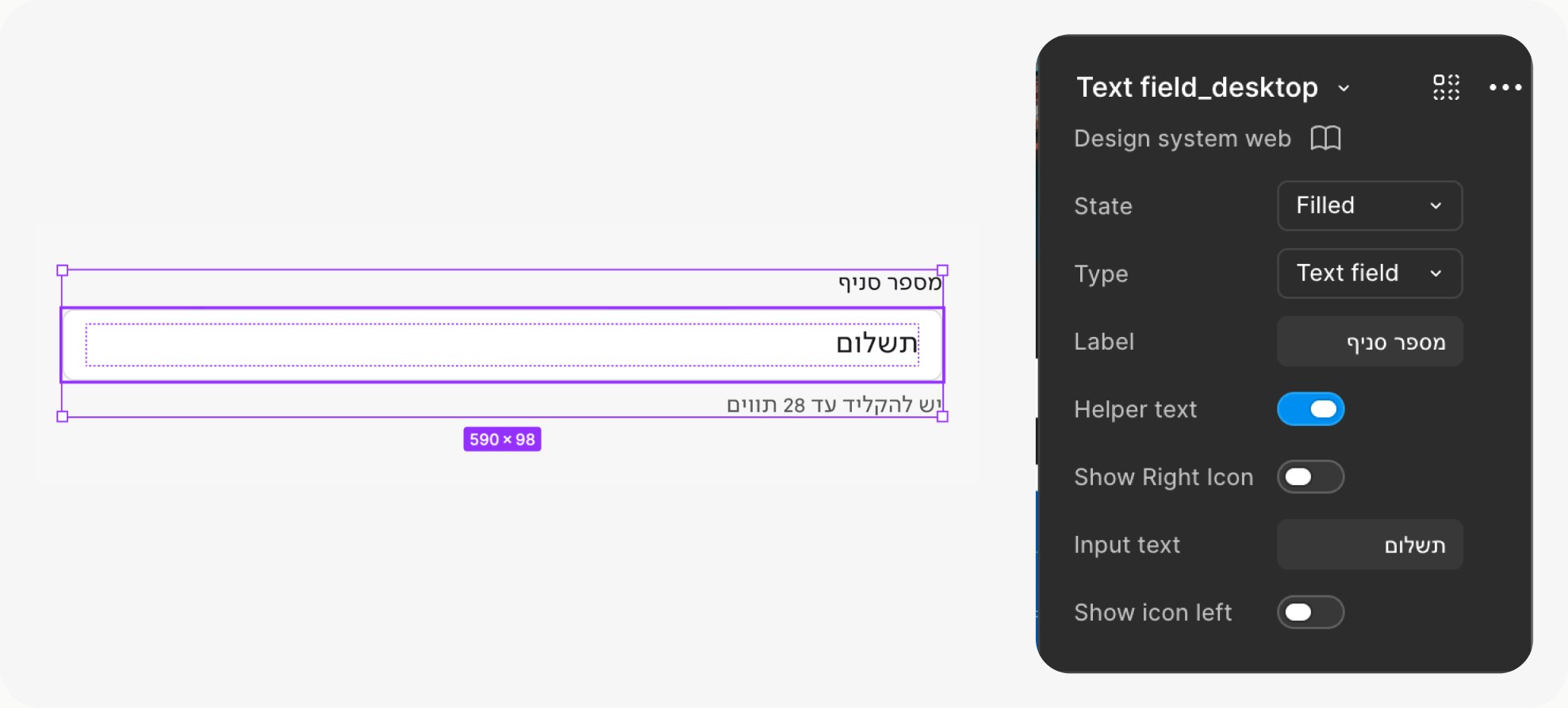
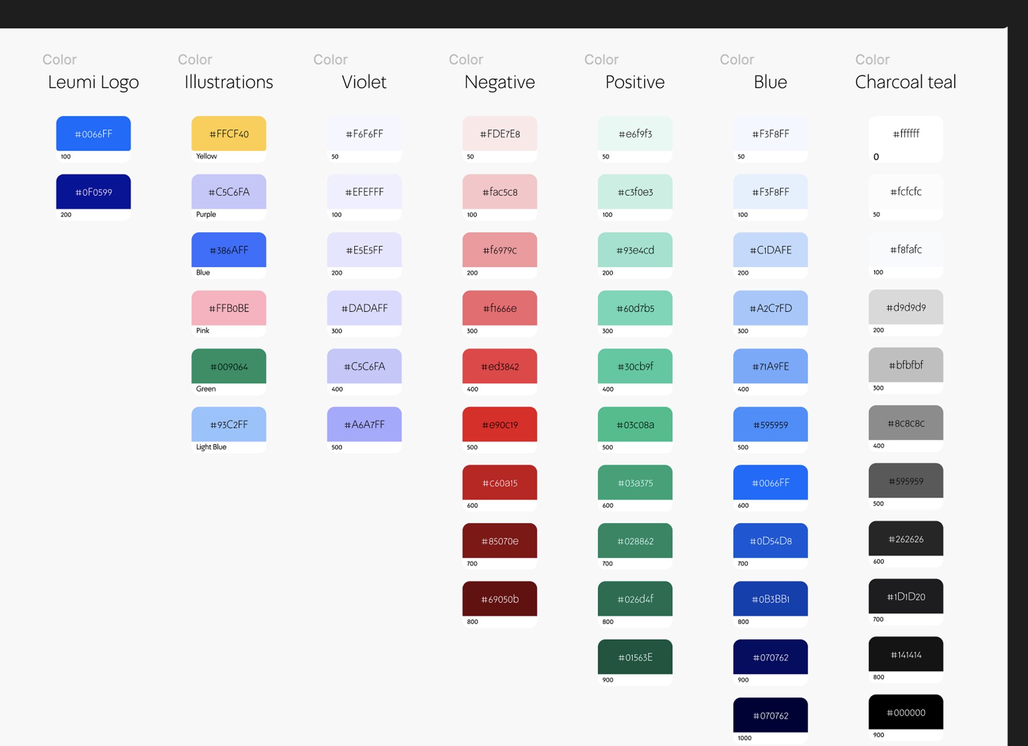
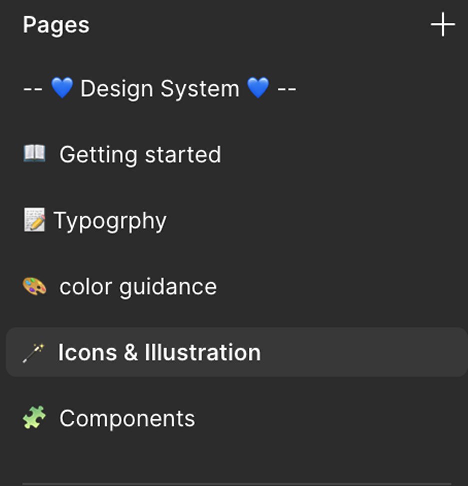
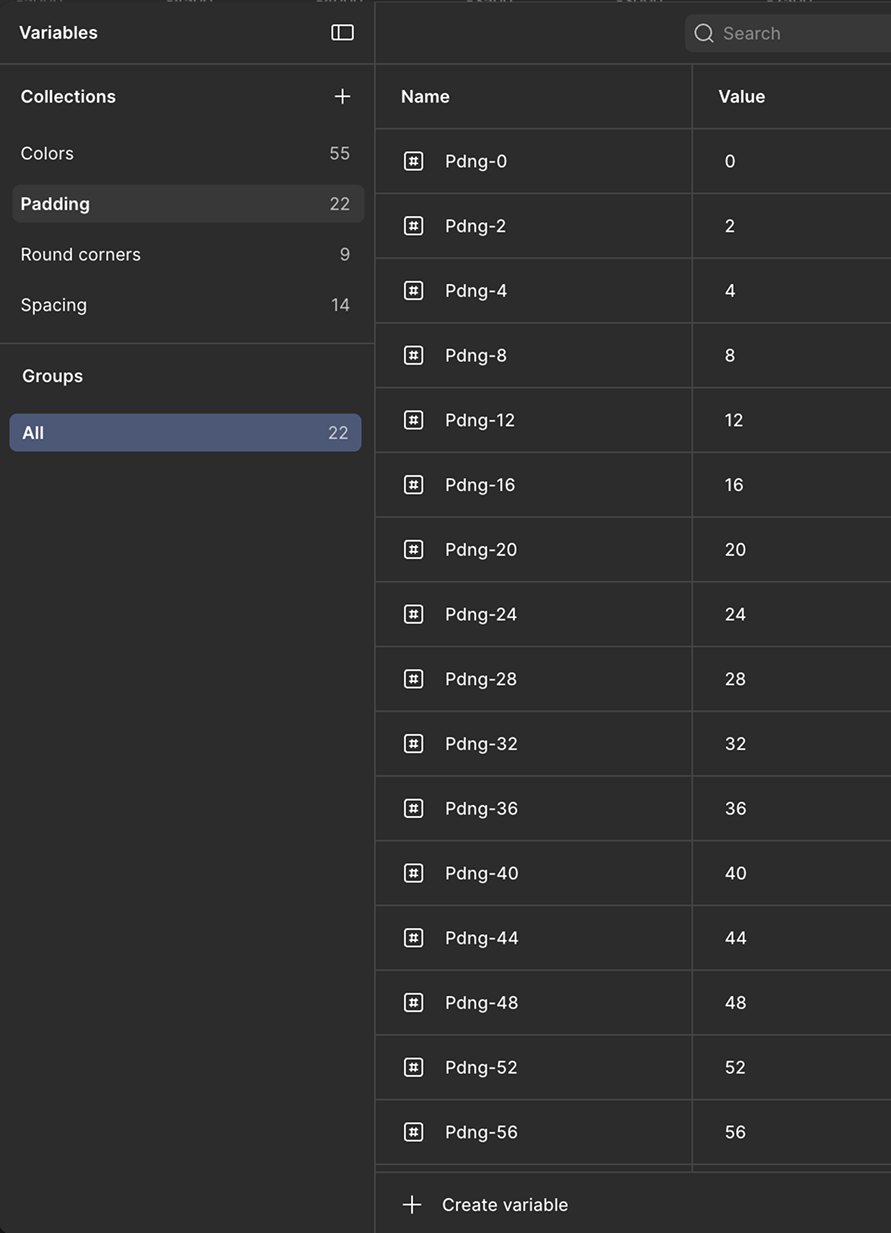
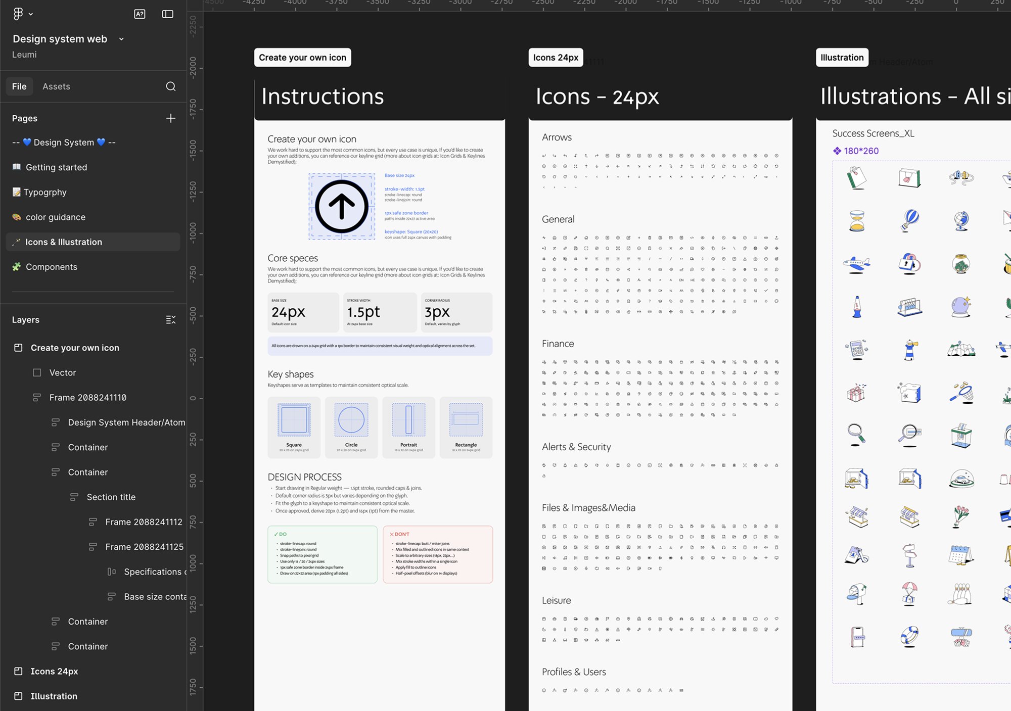
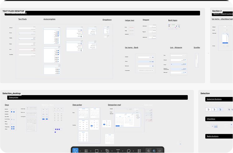
Before touching the flow, we built the foundation: a unified component and pattern library to serve all future flows on the site. The transfer flow was first. Everything else follows.
The solution
One clear step at a time.
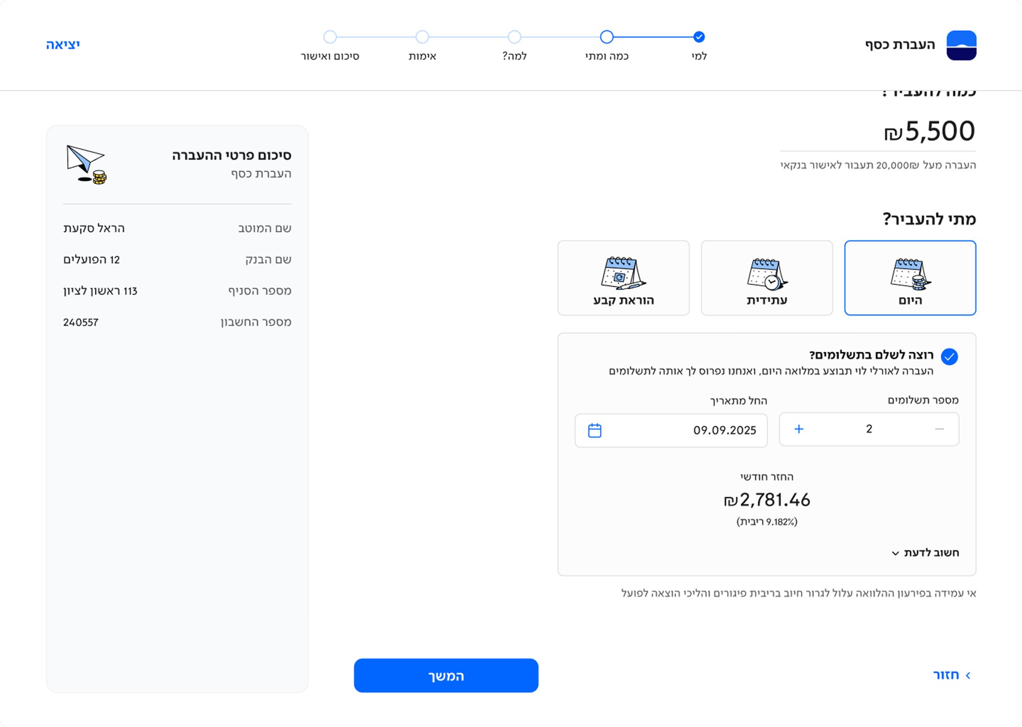
The money transfer flow was redesigned as a focused multi-step process: who you’re transferring to, how much and when, why, authentication, and confirmation. Each screen does one thing. The persistent summary panel on the left keeps users oriented without interrupting their progress.
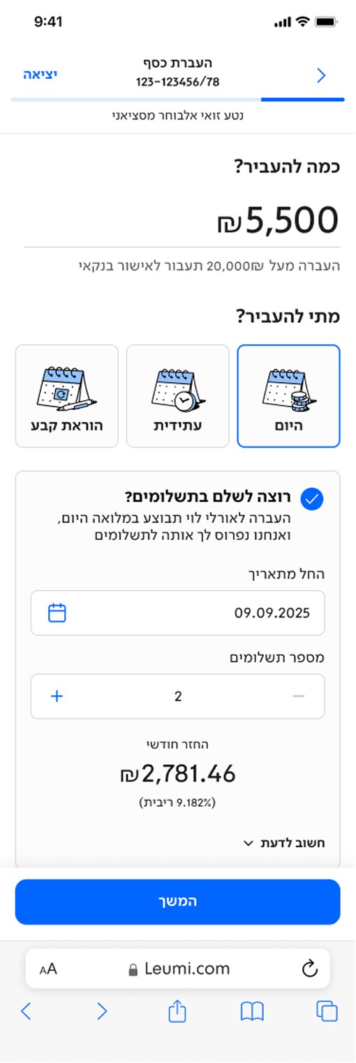
The flow handles significant branching: standing orders, future transfers, installment payments, foreign resident transfers and more. Each path has its own solution, all built within the same design system, so the experience stays coherent whichever route the user takes.
Transferring money with a payment plan.
Key design principles
Handoff for dev
Built for developers, not just for review.
A central part of this project was a clean, developer-ready handoff: smart, reusable components with documented motion specs. Not just polished assets, but a foundation built to scale. For me, this was one of the key learnings of the project.